

Continued from 51 Oil Portraits from Life: Community Remains, part one commencement of a dream

Precedent and inspiration of traditional oil painting
From the very beginning of my painting journey, I wanted to create a series of portraits. Closely examining the human face with its broad spectrum of facial expression is something that holds endless fascination for me. While all human beings are hardwired from infancy to seek out faces that return their gaze, I seem to have never satisfied the intensity of my own longing (Jarrett). As a child I remember painted portraits of both ancestors and strangers hung in the homes I inhabited. The images had a profound impact on my young mind, making me feel known and seen. I didn't necessarily view these portraits as works of art so much as proxies of the individuals they represented. Art History professor Shearer West touches on this unique function of the fine art portrait: "The portrait seems to offer the viewer a magical substitute for the individual depicted by bringing a past moment of that person's life into the present" (59). While I was never one to be curious about far-away places and cultures, portrait art, especially of those with a direct gaze from the sitter, have continually kept me curious about the individuals they represented and the communities from which they came.
I found inspiration in several modern portrait painting artists who painted portrait series of their communities, but I was stylistically and emotively most drawn to the work of Iowa modern portrait painter and artist Rose Frantzen. In her book Portrait of Maquoketa, Frantzen describes her own reason for starting the portrait painting series that inspired my own.
"In line at the grocery store one day, I looked around and saw all these people, all these faces, all ages, all these people I never really see. I wondered-maybe we never really look at each other, at ourselves. If I, as a visual artist, never really look at people I engage with on a daily basis, do they? The thought was - I should paint these people...all of them, any that are willing...no selection by me, let them select themselves. Maybe we can begin to see each other" (back cover).
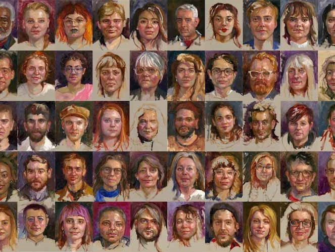
Franzen followed through on her impulse. She painted 180 portraits of residents in her small town of Maquoketa. The paintings all measured twelve by twelve inches and were painted in oils from life in just a twelve-month period. These portraits of ordinary people are extraordinary in their life-like variety and liveliness. One can almost hear the conversations they must have engaged in humming in the background. Laughter, secrets, and heartache are almost palpable. Franzen managed to record a quiet American community while finding her personal connection to that town and its people. In turn, her subjects and sitters learned about her painting process and style shedding common stereotypes of liberal contemporary artists. They enjoyed the benefit of being seen and heard and came together in support of each other.
Attempting to emulate such an original art feat in traditional portraiture while going to school seemed like a brazenly arrogant endeavor for me. But while my final year as an OCAC student progressed, I realized I had a unique and time-sensitive opportunity to record the faces of a small group of people desperately clinging on to a disappearing dream.
Ain’t nothing like the real thing: modern portrait painting from life
Like many aspiring artists, I initially learned to paint from reading books and watching online painting tutorials, or at least that's what I thought. Learning from reading and watching was not enough. I signed up for painting workshops from professional artists. I focused on painters that taught using live models, instinctively understanding that painting from a photograph was not the first-hand experience I was after. My own materials and portrait painting techniques followed a conglomerate of traditional alla prima (direct painting or wet into wet, as opposed to applying a glaze between dry layers of paint as is a common practice with egg tempera and classical oil painting by the old masters) methods introduced in the late 19th century into the 20th century. This approach championed by contemporary American Realist Richard Schmidt has been handed down to several successful painters who studied under Schmidt at the Palette and Chisel Academy of Fine Art in Chicago. Among these professional painters were a few of my own workshop teachers.
While I studied with several well-known realistic portrait artists who all contributed greatly to my knowledge, it was my class with professional artist Carolyn Anderson at scottsdale artists school that impacted my practice the most. when she described her process as up on a painting I knew had found structure or frame worked best for me.
Artists influenced by Richard Schmidt generally begin a painting by one or two of his preferred methods, both of which require the artist to have a clear idea of the picture they wish to paint (Schmidt 100). Unlike many visual artists, I have a tough time envisioning my portrait drawing clearly. My "mind pictures" are ephemeral in nature, always moving, changing, and evolving. In fact, I paint specifically in order to make sense of my subjects, just like I write in order to understand what I think. Sneaking up on a painting, enables my brush strokes to move with my subject: sketching, wiping, scribbling, scrubbing, dripping, all until I "find" the picture.
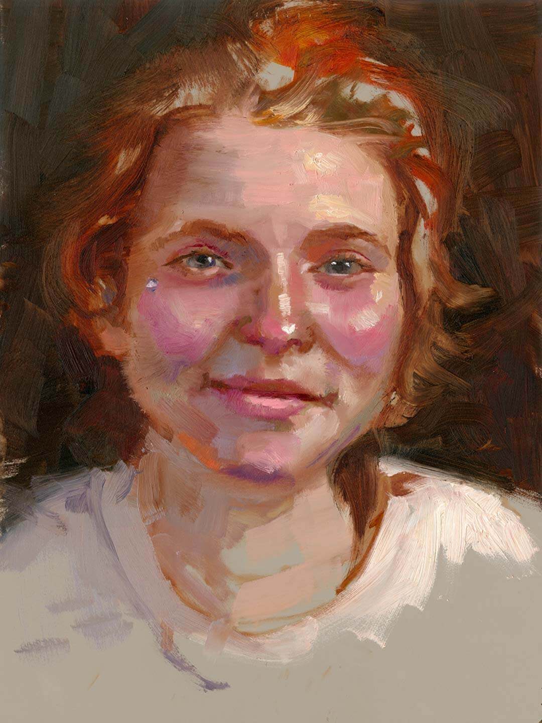
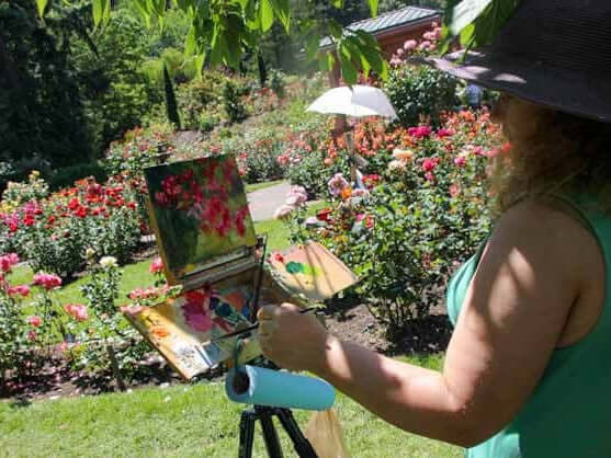
I enjoy using rigid surfaces to paint on. The bounce of stretched cotton or linen canvas has always annoyed me, and rigid surfaces tend to stand the test of time with less eventual cracking of the paint surface. I chose Richeson umber toned gesso hardboard panels for this series, appreciating the bevel edges, the warm neutral tone of the gesso, as well as its smooth but toothy surface. The primer formula of this brand is just slightly absorbent, mimicking traditional rabbit skin gesso used by Renaissance painters. This allows for a quick underpainting technique of a translucent layer of traditional oil colors, enabling a swift oil sketch without sacrificing my ability to push around thicker applications of color and an impasto technique in the finishing touches. The surface allows my painting to dry relatively quickly while still giving me a window of 24 hours to make adjustments as necessary to the finished painting.
I usually start my portraits by sketching with a thin layer of oil color and medium consisting of solvent, and a tiny bit of linseed oil. This dry brush layer is translucent and easy to wipe off for needed corrections. Anderson used a neutral mix, but I find myself gravitating to a warmer pigment in the underpainting. Beneath all our varied melanin producing skin cells our human flesh is red, pulsing with life giving blood. Lately I've favored Gamblin's Transparent Earth Red for this sketching under-layer of my painted skin tones. Red ochre has long been used by artists to depict the magic of being alive. The Gamblin color is a synthetic red oxide; I enjoy its greater vibrancy as compared to its ochre-based counterparts like burnt sienna or yellow ochre.
I usually use a small flat brush and often turn to my "nubs"-brushes that are worn down to just a few millimeters from their ferrule-for this initial sketch. The marks I make tend to be gestural and loose. I try to establish the position of the head, place a line for the center axis of the eyes, then nose, then mouth. The sequenced positioning of the marks is rarely the same order. Sometimes I'll outline an estimated shape for the hair; other times I jump directly to scribbling in my shadow, using raw umber pigment, a fairly new addition to my painting portrait palette.
I use a very limited palette in this initial observational drawing stage, and am careful to use very little titanium white which can muddy and cool the flesh tone too early in the process. My oil paints include earth tones, and ultramarine blue, sometimes mixed with a little ivory black to cut back on the saturation. It is later in the process of getting to the finished portrait that I will add other saturated synthetic pigments to my mixes.
For the most part, I practice what is what is called "sight sizing" in estimating my sitter's facial proportions. I place my sitter on the right of my canvas, at a distance where their face can fit in my substrate. This makes proportions one-to-one, eliminating any need for actual measuring and proportion calculation. My palette is placed at my left side (I am left-handed).
I didn't realize it until I had finished more than half the portraits, but I had set up the key light to illuminate the sitters at approximately forty-five-degree angle coming on their left side (the viewer's right). This is opposite to the portrait painting technique Western portraitists have traditionally used by lighting their subjects so that the flow of the light reads left to right mimicking the eye movement of reading. I suspect my painting portrait backward arrangement of the light has to do with formative years. My first language was Hebrew, reading right to left, and I often find myself instinctively favoring compositions that begin on the right.
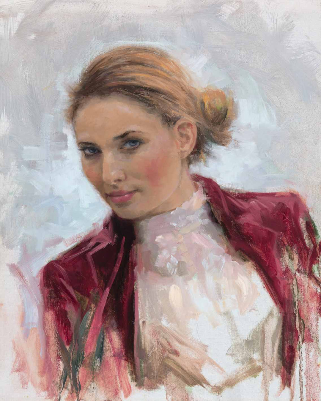
The primary lighting effect created on my sitters is either Rembrandt lighting, with one side of the being lit and the other having a triangle of light around the cheek area, or split lighting, where only one side of the face is lit. I enjoy this type of illumination both for its dramatic impact, and illusion of three-dimensional form-I want my sitter to look as if they are popping out of the canvas.
Most portrait artists will tell you they wish to portray the essence and presence of their subject, not just their likeness. I have learned over the years that essence, the non-physical qualities of a person, emerge organically-a natural byproduct inherent in spending one-on-one time with my subjects painting them realistically. Looking at my sitter, I try to find out what is unique to their face. While this response seems intuitive, neuroscientist V.S. Ramachandran and philosopher William Hirstein contend in "The Science of Art: A Neurological Theory of Aesthetic Experience" that I am utilizing the "peak-shift effect," a term used in Neuroaesthetics that describes the brain's propensity to prefer exaggerated abstractions of representation, or "supernormal stimulus". In other words, evolution has hardwired human brains to prefer and emotively respond to exaggeration, whether in form, color, gesture, space or motion. "Indeed, as we shall see," they announce in their riveting essay, "what the artist tries to do (either consciously or unconsciously) is to not only capture the essence of something but also to amplify it in order to more powerfully activate the same neural mechanisms that would be activated by the original object" (17).
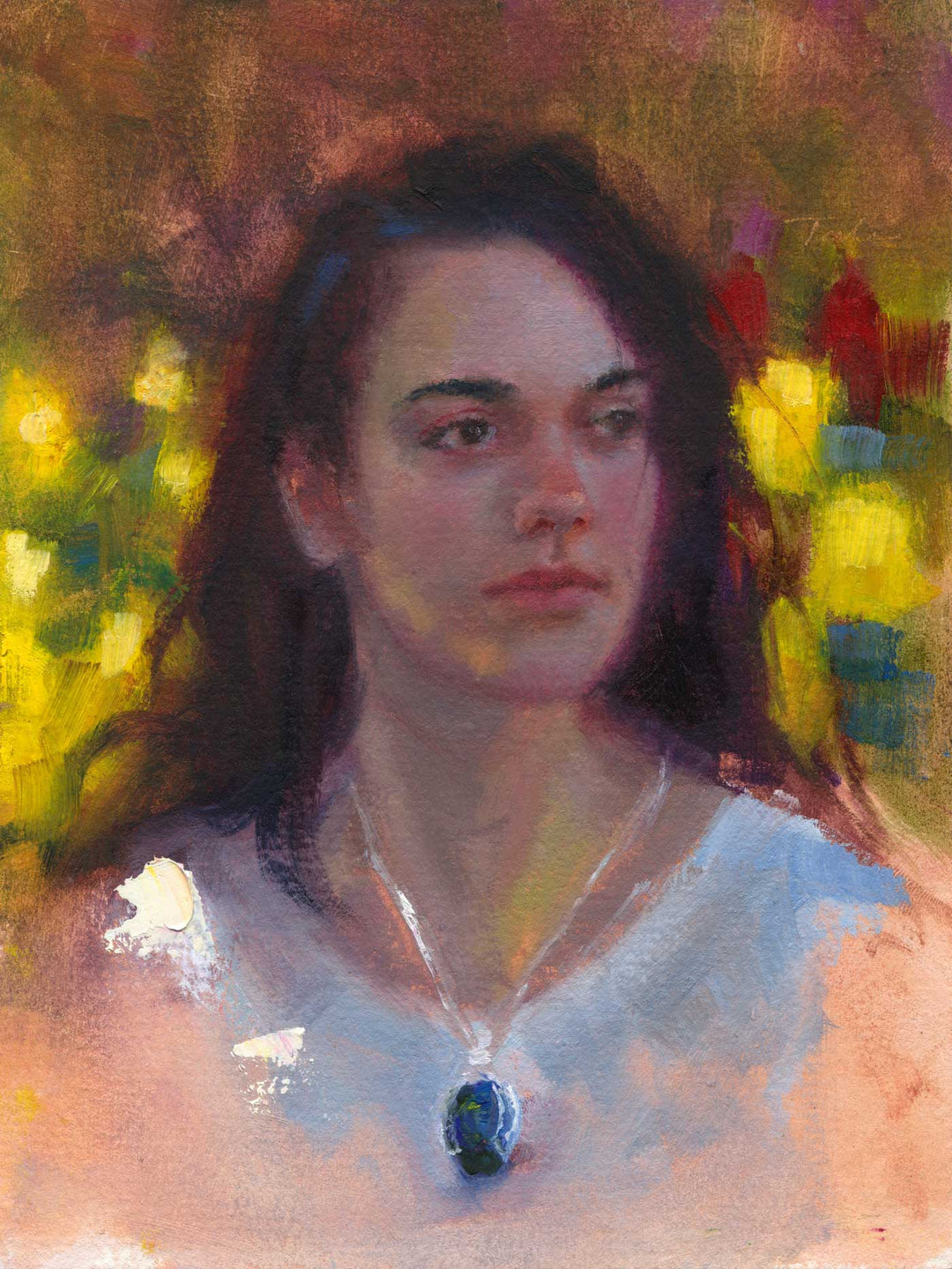
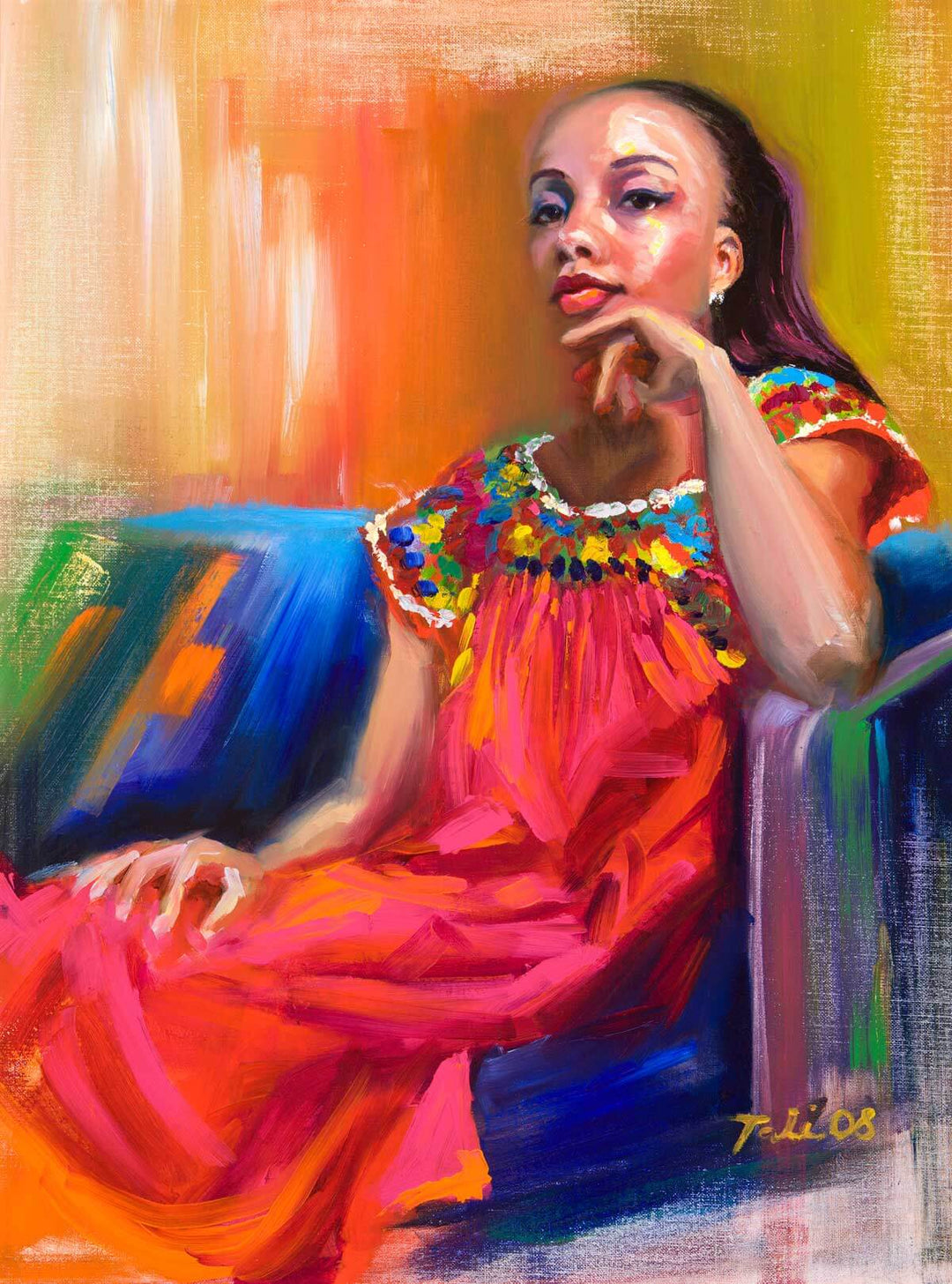
Once I feel I have emulated the sitter's general gesture and placed the five essential facial landmarks on the board (brows, eyes, nose, mouth, chin) I proceed applying a slightly thicker application of colour, usually bookmarking my values by indicating the darkest darks and the lightest lights. For the most part I paint from darks to lights and use a thicker application for the lightest flesh colour tints. The play between the largely transparent dark passages and the thicker opaque light application (impasto) using a large portion of white paint creates a sense of depth, placing the head believably within three-dimensional space. I want my viewer to get a sense of warmth from the flesh tones, which can only be conveyed through the atmosphere and dimension around the head.
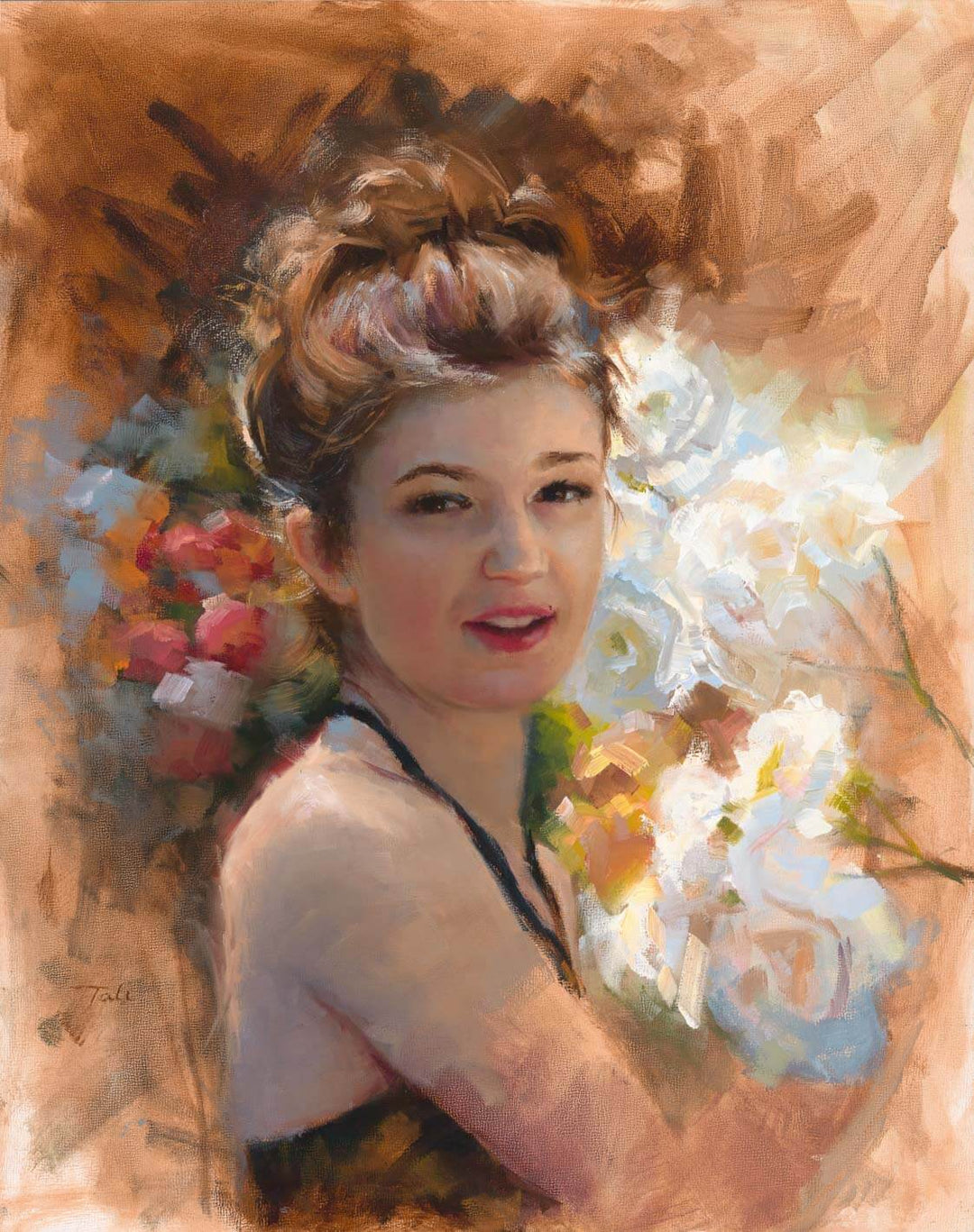
In reality, I had my studio wall covered with black paper, because I needed a cool contrast with the warmth of the flesh. However, in looking at all the paintings together, it is certainly not apparent that all the sitters sat in the same environment. The background colors are as varied as the sitters themselves. I've been asked quite often how I chose these varying background colors. I believe much of the time, the colors were influenced by what I or my subject was wearing, likely due to the reflective nature of the black paper. Other times the color seemed to be a response to the skylights that indirectly lit my studio. And still others seemed to be informed by the person themselves. A notable example can be seen in portraits thirty and thirty-one. The two sitters are roommates and wanted to be painted one after the other. It's fairly clear that the hair color of my first subject informed the background color of the second.
I painted a little from memory and a little from the reference photo I took at the end of each session.
Are we there yet?
From the very beginning of this project I knew I wanted to abandon the portraits before I felt they were "finished", not that I feel my paintings are ever really finished. I often have to abandon my paintings before I feel they are complete; it is the nature of painting and observational drawing that the more we look the more we see. There is no real finish line in a painting, just deadlines for clients. But for this project I wanted a distinct feeling of incompleteness and deliberate abandonment in order to echo the closing of OCAC. Most of the community feels the rug was pulled out from underneath them, and we had to evacuate before the completion of our education. The constraint I put on myself was two hours working from life, with a half of an hour after the sitter left. But as the project progressed, I found myself putting my brush down only after I felt my painted subject looking back at me.
Sometimes this happened very quickly, well before the allotted time. In those cases, I enjoyed playing with colors and making tiny adjustments to capture a conglomerate of facial expressions. Other times I had to return to a painting, repeatedly making adjustments. This inconsistency of finish level in the final painting group portrait adds some needed dynamism to the work when all portraits are hung butted next to each other.
Continued in part 3, the intuitive slow art of seeing
Works Cited
Frantzen, Rose. Portrait of Maquoketa. Old City Hall Press, 2009. Portrait of Maquoketa information and book available here.
Jarrett, Christian. "The Psychology Of Eye Contact". Research Digest, 2016, https://digest.bps.org.uk/2016/11/28/the-psychology-of-eye. Accessed 27 Dec 2019.
*Schmid, Richard, and Katie Swatland. Alla Prima II Everything I Know About Painting—
And More. 1st ed., Stove Prairie Press, LLC, 2013.
Ramachandran, Vilayanur & Hirstein, William. “The Science of Art: A Neurological Theory of Aesthetic Experience”1999, PDF.
*West, Shearer. Portraiture. Oxford University Press, 2004.
*Affiliate links
Leave a comment